Your Complete Tailwind CSS Primer

CSS frameworks have changed the way developers approach web development by providing pre-built components and styles. However, many frameworks come with opinionated designs and bloated stylesheets which limit customization.
Tailwind CSS takes a different approach. As a utility-first CSS framework, it provides low-level utility classes that allow developers to build custom designs without being constrained by pre-defined components.
With over 675,375 websites using Tailwind CSS and over 8.61 million dependent repositories, Tailwind has become more than just another CSS framework.
In this article, we’ll go over understanding the concepts of Tailwind CSS, the setup process, and practical usage so you can start building your beautiful custom UIs without learning CSS.
Let’s get started!
What Is Tailwind CSS?
Tailwind CSS is a highly customizable, low-level CSS framework that provides a set of utility classes to rapidly build custom user interfaces. It was first developed and released by Adam Wathan in 2017.
Since then, Tailwind has seen an upward trajectory in websites being built using the Tailwind library.
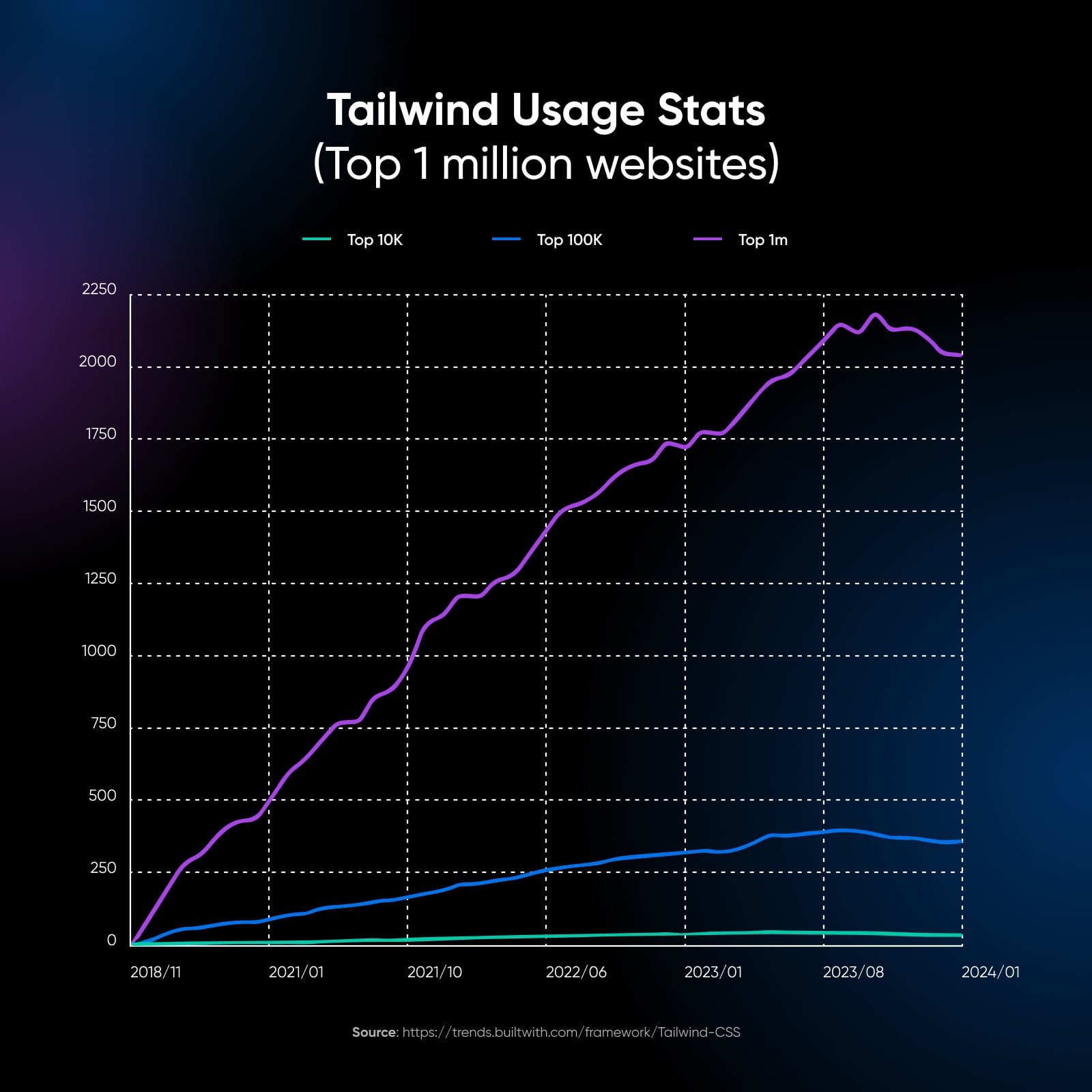
While the growth currently seems to have slowed as per the BuiltWith charts, the framework itself is regularly updated with new features, classes, and more.
According to BuiltWith’s tech stack data, over 100,000 websites in the US alone use Tailwind to build their user interfaces along with the UK, Indonesia, Germany, and other countries making it to the top 10 users of this library.

The core philosophy behind Tailwind CSS is to provide developers with a set of building blocks rather than pre-built components. These building blocks are small, single-purpose utility classes that can be combined to create complex and responsive layouts.
This approach allows for greater flexibility and control over the design, as you can customize every aspect of your UI without being limited by the framework’s opinionated styles.
What Makes Tailwind CSS Different?
Traditionally, when working with CSS, developers write custom classes in separate stylesheets to style their HTML elements. This approach can lead to large CSS files and make maintaining and updating styles across a project challenging.
Tailwind provides a comprehensive set of utility classes that can be applied directly to HTML elements. These classes are highly composable, allowing developers to build complex, custom designs without writing a single line of custom CSS.
For example, instead of writing a custom CSS class to style a button, you can use Tailwind’s pre-defined classes like this:
<button class="bg-blue-500 hover:bg-blue-700 text-white font-bold py-2 px-4 rounded">
  Button
</button>
This approach has several benefits:
- Faster development: The pre-defined classes help developers rapidly build and iterate on designs without constantly switching between HTML and CSS files.
- Consistent styling: Tailwind provides a standardized set of classes, which helps maintain consistency in design across a project.
- Smaller CSS files: Because styles are applied directly in the HTML, there’s no need for large, custom CSS files.
- Easier maintenance: With styles defined in the HTML, it’s easier to see how changes will affect a specific element without hunting through separate CSS files.
- Better performance: Many modern styling systems like Emotion or Styled Components rely on javascript (usually during run-time, slower performance) to render your css. Tailwind is just CSS at the end of the day.
Tailwind turned me into a complete stack developer 🤝”
— Boris Lepikhin
Getting Started With Tailwind CSS
Before we jump into examples, let’s set up a basic project with Tailwind CSS. We’ll assume you have some familiarity with HTML and CSS. Also, you need to have npm installed on your system. Once you’re done, you’re good to go ahead!
Create a new directory for your project and navigate into it:
mkdir my-tailwind-project
cd my-tailwind-project
Initialize a new npm project and install Tailwind CSS:
npm init -y
npm install -D tailwindcss
Create a tailwind.config.js file:
npx tailwindcss initCreate an input.css file and add the following:
@tailwind base;
@tailwind components;
@tailwind utilities;
Update your tailwind.config.js file to process your input.css:
module.exports = {
  content: ["./src/**/*.{html,js}"],
  theme: {
    extend: {},
  },
  plugins: [],
}
Create an index.html file in a src directory and add the following:
<!DOCTYPE html>
<html>
  <head>
    <link href="/dist/output.css" rel="stylesheet">
  </head>
  <body>
    <h1 class="text-3xl font-bold text-center mt-4">Welcome to Tailwind CSS!</h1>
  </body>
</html>
Build your CSS:
npx tailwindcss -i ./src/input.css -o ./src/output.css --watchNow, when you open index.html in your browser, you should see a large, bold heading that says Welcome to Tailwind CSS!
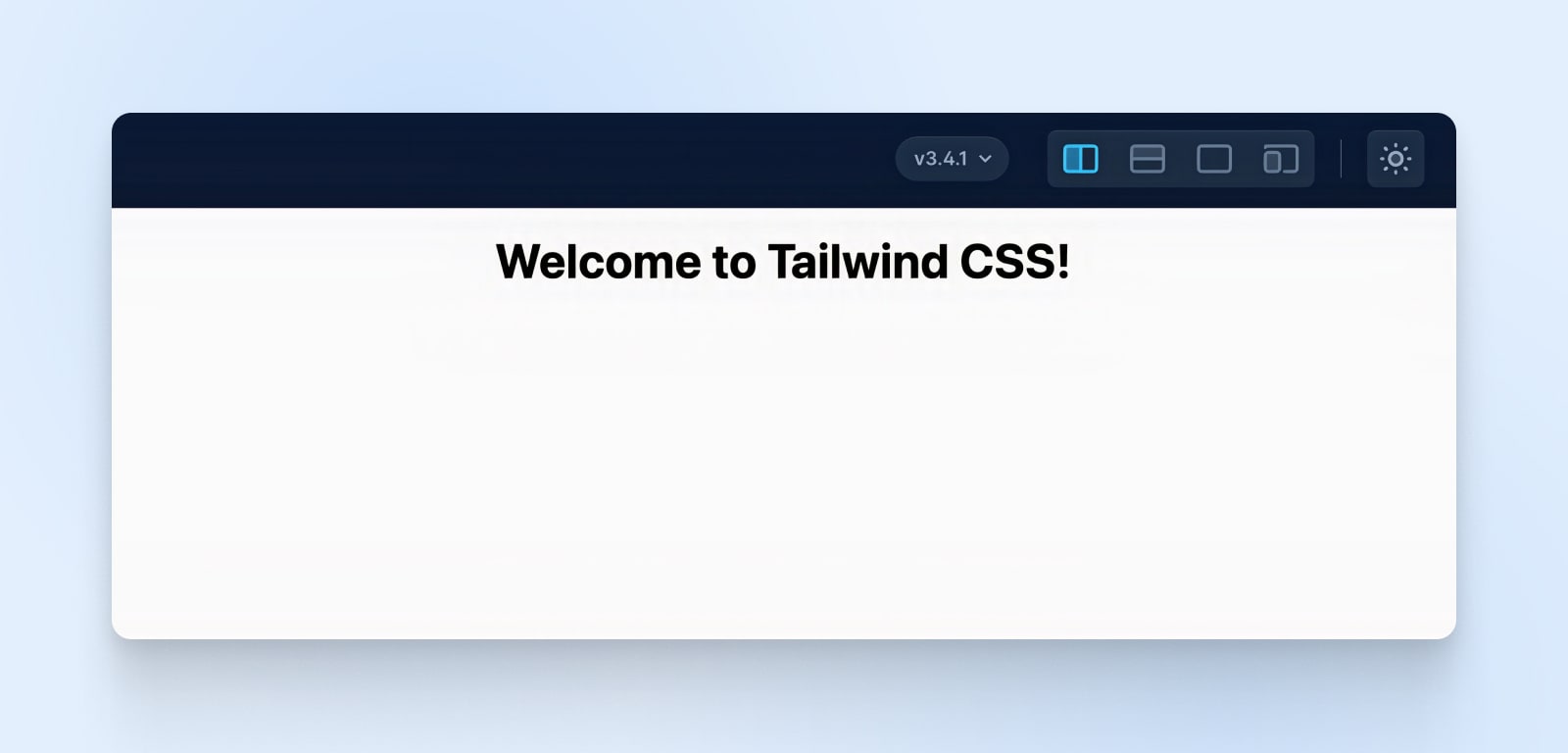
Congratulations, you’ve set up your first Tailwind project!
Tailwind CSS Utility Classes
Tailwind CSS provides a wide range of utility classes that cover various aspects of styling, such as layout, spacing, typography, colors, and more. These classes follow a naming convention that makes it intuitive to understand their purpose.
Typography
Typography is a process of arranging a typeface in variations of font, size, and spacing. This involves making text’s appearance, style, and arrangement readable and visually pleasing.
Read MoreLet’s explore some commonly used utility classes in Tailwind CSS.
Tailwind Layout Classes
- flex: Applies a flex container.
- grid: Applies a grid container.
- block: Displays an element as a block-level element.
- inline: Displays an element as an inline-level element.
Example:
<div class="flex">
  <div>Item 1</div>
  <div>Item 2</div>
</div>
Tailwind Spacing Classes
- m-{size}: Applies margin on all sides.
- p-{size}: Applies padding on all sides.
- mx-{size}: Applies margin on the left and right.
- py-{size}: Applies padding on the top and bottom.
Example:
<div class="m-4 p-2">
  Content with margin and padding
</div>
Tailwind Typography Classes
- text-{size}: Sets the font size.
- font-{weight}: Sets the font weight.
- text-{color}: Sets the text color.
- uppercase, lowercase, capitalize: Transforms text case.
Example:
<p class="text-lg font-bold text-blue-500 uppercase">
  Styled text
</p>
Tailwind Colors
Tailwind CSS provides a default color palette that can be customized. Colors are defined using a combination of the color name and shade.
- bg-{color}-{shade}: Sets the background color.
- text-{color}-{shade}: Sets the text color.
- border-{color}-{shade}: Sets the border color.
Example:
<button class="bg-blue-500 text-white border-2 border-blue-700">
  Button
</button>
Tailwind Classes For Responsive Design
Tailwind makes it easy to create responsive designs by providing responsive variants for most of its utility classes. These variants allow you to specify different styles for different screen sizes.
Tailwind uses a mobile-first approach, where the base styles are applied to all screen sizes, and then larger screen sizes are targeted using responsive prefixes:
- sm: Applies styles to small screens and up (640px and up).
- md: Applies styles to medium screens and up (768px and up).
- lg: Applies styles to large screens and up (1024px and up).
- xl: Applies styles to extra-large screens and up (1280px and up).
- 2xl: Applies styles to extra-extra-large screens and up (1536px and up).
To use these responsive variants, simply prefix the utility class with the desired screen size:
<div class="bg-blue-500 md:bg-green-500 lg:bg-red-500">
  <!-- Content -->
</div>
In this example, the div will have a blue background on small screens, a green background on medium screens, and a red background on large screens.
You can also use responsive variants to control the layout of your elements:
<div class="flex flex-col md:flex-row">
  <div class="w-full md:w-1/2 lg:w-1/3">Column 1</div>
  <div class="w-full md:w-1/2 lg:w-1/3">Column 2</div>
  <div class="w-full md:w-1/2 lg:w-1/3">Column 3</div>
</div>
Here, the columns will stack vertically on small screens, display in two columns on medium screens, and three columns on large screens.
Get Content Delivered Straight to Your Inbox
Subscribe to our blog and receive great content just like this delivered straight to your inbox.
Customizing The Default Classes Of Tailwind CSS
One of the strengths of Tailwind CSS is its customization options. You can easily customize the default configuration to match your project’s design requirements. The tailwind.config.js file allows you to extend or override the default settings.
Here are a few common customization options. You can totally customize every part of Tailwind, so this isn’t an exhaustive list by any means.
Colors
Tailwind CSS provides a rich color palette out of the box, but you can easily customize it to match your project’s branding or design requirements. The tailwind.config.js file allows you to extend or override the default color palette. To add custom colors, you can use the extend property within the colors object:
// tailwind.config.js
module.exports = {
  theme: {
    extend: {
      colors: {
        'brand-primary': '#ff5a5f',
        'brand-secondary': '#484848',
        'brand-accent': '#ffcc00',
      },
    },
  },
}
In this example, we’ve added three custom colors: brand-primary, brand-secondary, and brand-accent.
These colors can now be used with utility classes like bg-brand-primary, text-brand-secondary, border-brand-accent, etc. You can also modify existing color shades or add new shades to the default color palette like so:
// tailwind.config.js
module.exports = {
  theme: {
    extend: {
      colors: {
        blue: {
          '100': '#e6f0ff',
          '200': '#c3d9ff',
          '300': '#a1c2ff',
          '400': '#7eabff',
          … and so on …
        },
      },
    },
  },
}
Font Family
Tailwind CSS uses a default font family stack, but similar to colors, you can change these defaults to match your project’s typography style.
In the tailwind.config.js file, you can extend or replace the default font family. To add custom font families, use the extend property within the fontFamily object:
// tailwind.config.js
module.exports = {
  theme: {
    extend: {
      fontFamily: {
        sans: ['Poppins', 'sans-serif'],
        serif: ['Merriweather', 'serif'],
        mono: ['Fira Code', 'monospace'],
      },
    },
  },
}
You can also completely replace the default font family by omitting the extend property:
// tailwind.config.js
module.exports = {
  theme: {
    fontFamily: {
      'body': ['Open Sans', 'sans-serif'],
      'heading': ['Montserrat', 'sans-serif'],
    },
  },
}
Responsive Breakpoints
Tailwind CSS provides a responsive design system out of the box, but you can further customize it to match your project’s specific breakpoints and responsive requirements.
By modifying the screens object in the tailwind.config.js file, you can define custom breakpoints and apply different styles based on screen sizes.
For example, let’s say you have a unique breakpoint at 1440px where you want to apply specific styles:
// tailwind.config.js
module.exports = {
  theme: {
    screens: {
      'xs': '480px',
      'sm': '640px',
      'md': '768px',
      'lg': '1024px',
      'xl': '1440px',
    },
  },
}
With this custom breakpoint defined, you can use responsive utility classes like xl:text-lg, xl:flex, xl:w-1/2, etc., to apply styles specifically for screens wider than 1440px.
Spacing
Tailwind CSS provides a comprehensive set of spacing values for margins, paddings, and other spacing-related utilities. You can customize these values to match your project’s layout requirements. To add custom spacing values, use the extend property within the spacing object:
// tailwind.config.js
module.exports = {
  theme: {
    extend: {
      spacing: {
        '13': '3.25rem',
        '15': '3.75rem',
        '128': '32rem',
        '144': '36rem',
      },
    },
  },
}
Integrating Third-Party Libraries
Tailwind CSS integrates with popular front-end libraries and frameworks like React, Vue, and Angular. When working with these libraries, you can leverage Tailwind’s utility classes to style your components to create consistent and maintainable user interfaces. For example, in a React component, you can apply Tailwind utility classes directly to the JSX elements:
import React from 'react';

const Card = () => {
  return (
    <div className="bg-white shadow-md rounded-lg p-6">
      <h2 className="text-2xl font-bold mb-4">Card Title</h2>
      <p className="text-gray-600">Card content goes here...</p>
    </div>
  );
};

export default Card;
This multi-framework approach makes it really easy to bring together the best of all worlds, helping you create a beautiful app with almost no effort.
Building A Simple Application In Tailwind CSS
Let’s say you’re building a simple landing page for a fictional online course platform called LearnHub using Tailwind to style the entire page.
Step 1: Setting Up The HTML Structure
First, let’s create the basic HTML structure for our landing page:
<!DOCTYPE html>
<html lang="en">
<head>
  <meta charset="UTF-8">
  <meta name="viewport" content="width=device-width, initial-scale=1.0">
  <link href="output.css" rel="stylesheet">
  <title>LearnHub - Online Course Platform</title>
</head>
<body>
  <header>
    <!-- Navigation menu will go here -->
  </header>

  <main>
    <!-- Main content will go here -->
  </main>

  <footer>
    <!-- Footer content will go here -->
  </footer>
</body>
</html>
In this step, we’ve set up the basic structure of our HTML document. We have the <head> section where we include the necessary meta tags and link to our CSS file (output.css). Inside the <body>, we have the <header>, <main>, and <footer> sections where we’ll add our content.
Step 2: Creating The Navigation Menu
Now, let’s add a simple navigation menu to the <header> section using Tailwind CSS utility classes:
<header class="bg-blue-600 text-white py-4">
  <nav class="container mx-auto flex justify-between items-center">
    <a href="#" class="text-2xl font-bold">LearnHub</a>
    <ul class="flex space-x-4">
      <li><a href="#" class="hover:text-blue-200">Courses</a></li>
      <li><a href="#" class="hover:text-blue-200">Pricing</a></li>
      <li><a href="#" class="hover:text-blue-200">About</a></li>
    </ul>
  </nav>
</header>
Here’s what each class does:
- bg-blue-600: Sets the background color of the header to a shade of blue.
- text-white: Sets the text color to white.
- py-4: Adds padding to the top and bottom of the header.
- container mx-auto: Centers the navigation menu horizontally.
- flex justify-between items-center: Uses flexbox to space out the logo and menu items evenly and align them vertically.
- text-2xl font-bold: Makes the logo text larger and bold.
- flex space-x-4: Adds spacing between the menu items using flexbox.
- hover:text-blue-200: Changes the text color to a lighter shade of blue when hovering over the menu items.
Step 3: Adding The Main Content
Let’s add some content to the <main> section of our landing page:
<main class="container mx-auto mt-8">
  <section class="bg-gray-100 rounded-lg p-6">
    <h1 class="text-3xl font-bold mb-4">Welcome to LearnHub</h1>
    <p class="text-gray-700 mb-6">Discover a world of knowledge with our online courses.</p>
    <a href="#" class="bg-blue-600 text-white px-4 py-2 rounded hover:bg-blue-700">Start Learning</a>
  </section>

  <section class="mt-8">
    <h2 class="text-2xl font-bold mb-4">Featured Courses</h2>
    <div class="grid grid-cols-1 sm:grid-cols-2 lg:grid-cols-3 gap-4">
      <!-- Course cards will go here -->
    </div>
  </section>
</main>
Here’s what each class does:
- container mx-auto: Centers the main content horizontally.
- mt-8: Adds margin to the top of the main content.
- bg-gray-100 rounded-lg p-6: Adds a light gray background, rounds the corners, and adds padding to the welcome section.
- text-3xl font-bold mb-4: Makes the heading text larger, bold, and adds margin at the bottom.
- text-gray-700 mb-6: Sets the text color to a darker gray and adds a margin at the bottom for the paragraph.
- bg-blue-600 text-white px-4 py-2 rounded hover:bg-blue-700: Styles the Start Learning button with a blue background, white text, padding, rounded corners, and a darker blue background on hover.
- text-2xl font-bold mb-4: Makes the Featured Courses heading larger, bold, and adds margin at the bottom.
- grid grid-cols-1 sm:grid-cols-2 lg:grid-cols-3 gap-4: Creates a responsive grid layout for the course cards. It shows one column on small screens, two columns on medium screens, and three columns on large screens, with a gap between the cards.
Putting the header and main code together you should have the following output:

Step 4: Adding The Footer
Finally, let’s add a simple footer to our landing page:
<footer class="bg-gray-800 text-white py-4 mt-8">
<div class="container mx-auto text-center">
<p>© 2023 LearnHub. All rights reserved.</p>
</div>
</footer>Here’s what each class does:
- bg-gray-800 text-white: Sets the background color of the footer to a dark gray and the text color to white.
- py-4: Adds padding to the top and bottom of the footer.
- mt-8: Adds margin to the top of the footer.
- container mx-auto: Centers the footer content horizontally.
- text-center: Centers the text within the footer.
Putting It All Together
Here’s the final code put together:
<!DOCTYPE html>
<html lang="en">
<head>
<meta charset="UTF-8" />
<meta name="viewport" content="width=device-width, initial-scale=1.0" />
<link href="output.css" rel="stylesheet" />
<title>LearnHub - Online Course Platform</title>
</head>
<body>
<header class="bg-blue-600 py-4 text-white">
<nav class="container mx-auto flex items-center justify-between">
<a href="#" class="text-2xl font-bold">LearnHub</a>
<ul class="flex space-x-4">
<li><a href="#" class="hover:text-blue-200">Courses</a></li>
<li><a href="#" class="hover:text-blue-200">Pricing</a></li>
<li><a href="#" class="hover:text-blue-200">About</a></li>
</ul>
</nav>
</header>
<main class="container mx-auto mt-8">
<section class="rounded-lg bg-gray-100 p-6">
<h1 class="mb-4 text-3xl font-bold">Welcome to LearnHub</h1>
<p class="mb-6 text-gray-700">Discover a world of knowledge with our online courses.</p>
<a href="#" class="rounded bg-blue-600 px-4 py-2 text-white hover:bg-blue-700">Start Learning</a>
</section>
<section class="mt-8">
<h2 class="mb-4 text-2xl font-bold">Featured Courses</h2>
<div class="grid grid-cols-1 gap-4 sm:grid-cols-2 lg:grid-cols-3">
<!-- Course cards will go here -->
</div>
</section>
</main>
<footer class="mt-8 bg-gray-800 py-4 text-white">
<div class="container mx-auto text-center">
<p>© 2023 LearnHub. All rights reserved.</p>
</div>
</footer>
</body>
</html>To display the output to users, you’ll need to have Tailwind CSS properly set up in your project. Make sure you have followed the installation steps mentioned earlier, including creating the tailwind.config.js file and processing your CSS with Tailwind.
Once you have Tailwind CSS set up, you can save this code in an HTML file (e.g., index.html) and open it in a web browser. The browser will render the landing page with the styles applied using Tailwind CSS utility classes. If you simply want to test Tailwind, you can always use Tailwind Play, a nifty little tool by Tailwind where you can play with the different classes.

And there you have it! We’ve created a simple landing page for our fictional online course platform using Tailwind CSS utility classes.
Where To Go From Here?
Now that you’ve seen the power and flexibility of Tailwind CSS, you know the possibilities are endless here. Its flexible and customizable nature can help you build anything from simple landing pages to complex web applications while maintaining a clean and consistent design.
Here are some ideas to get you started:
- Build a portfolio website: Show your skills and projects with a stunning portfolio.
- Create a blog: Share your thoughts and ideas with the world using a beautiful and functional blog designed with Tailwind.
- Develop a web application: Tailwind CSS is perfect for building user interfaces for web applications of all kinds.
No matter what you build, Tailwind CSS can help you create a stunning and well-functioning website.
And when it comes to hosting your creation, consider a reliable and scalable solution like DreamHost’s VPS services to ensure your website runs smoothly and efficiently.
Start building beautiful user interfaces with minimal CSS know-how!
Create a Website for All
We make sure your website is fast and secure so you can focus on the important stuff.
